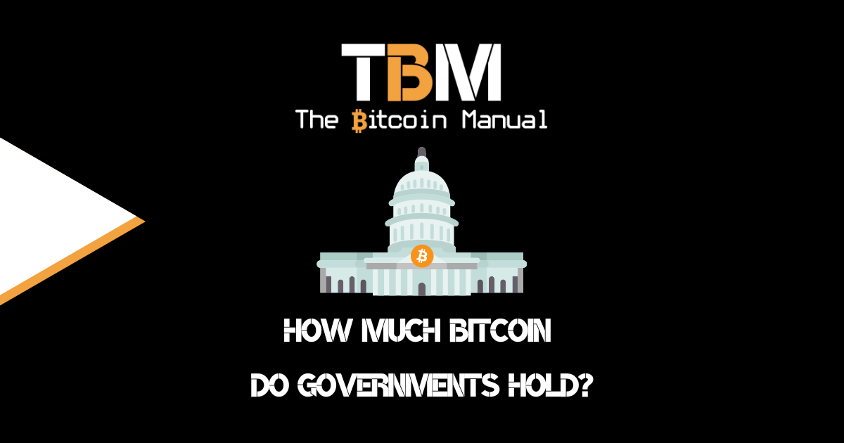
How Much Bitcoin Do Governments Hold?
Germany’s latest sale of 50,000 Bitcoin has revealed a number of large Bitcoin holders that very few of us pay attention to. Believe it or
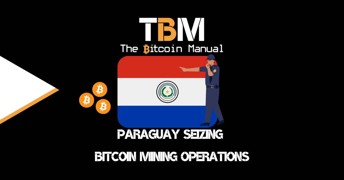
Paraguay Seizing Bitcoin Mining Operations
The biggest incentive for Bitcoin miners to move to Paraguay comes from the Itaipu Dam, which is co-owned by Brazil and Paraguay. The hydroelectric dam is
Mt. Gox Repayment Program Set To Begin
2024 has been the year of liquidation. First, the German government decided to offload the 50,000 coins it seized from Movies 2k. During those 27