Home » Bitcoin Culture » BTC Glossary » Wick

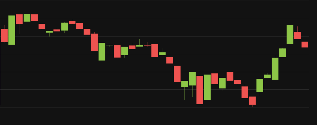
When you look at Bitcoin price charts in “candle view”, you will see red candle and green candles, which represent the price movement of Bitcoin in a given time frame.
You may also notice that there is a thin line that sticks out from the top or bottom of these candles – these are called “wicks”, like candle wicks – which you can see in the image below. They are also called “trails” or “shadows” but wicks makes more sense to us!
The main body of the candle is the price that Bitcoin began (opened) and finished (closed) at in the time period specified in your candlestick chart. The wick is the highest and lowest price that Bitcoin reached in that time period.


Dear Alby Users, We always knew this day would come when the training wheels would have to come off, and that day is set in

The market looks somewhat frothy these days; the semblance of a banana zone is forming, which usually turns into a come-and-get-the-bag plea to all the

Bitcoin’s meteoric rise from darknet settlement currency to a 1 trillion dollar asset class has broken many models and average investors’ brains along the way.